
Cirkel
designing a MVP web platform that enables transformative peer circles

Dates: Apr-May 2023
Role: Product Design Intern, Visual Design Lead
Tools: Figma, Miro
Problem
Cirkel is an early-stage startup with a vision to help every person define and create trusting relationships through supportive peer groups.
To accomplish this, the co-founders envision a B2B/B2C web platform that facilitates supportive peer group sessions.
My teammates and I were responsible for designing the MVP that would be shared with angel investors.
Solution
Our process entailed an end-to-end design of the MVP.
As the visual/UI design lead, I also created the design system/ branding elements and ensured all high-fidelity screens were aligned.
The final prototype was featured at a social impact conference and generated multiple leads from potential partners and investors.
Final Design

Participant Onboarding Survey: get matched into a new Cirkel group

Cirkel Participant Dashboard: view tasks & resources, join group sessions
Process
Given the constraint of a 4-week timeline, our team created a project plan that outlined our deliverables and tasks within a short turnaround.

Discover | COMPETITOR ANALYSIS
Competitive research found that Cirkel needs to differentiate through clear(er) positioning
During our initial kickoff call with the co-founders, my team gathered information about the business model, goals, constraints, and defined project success.
It became clear we needed to better understand how Cirkel fit into the landscape of existing solutions.
I focused on assessing features, branding, and business positioning of competitors.
Opportunities for Cirkel:
Providing a tailored matching process and user journey
Clarifying the purpose and features of the solution
Conveying the ‘feeling’ of the solution through fresh visuals and content

Discover | INTERVIEWS
Participants agree: peer groups are helpful but difficult to maintain
To understand current engagement with peer support groups, my team conducted 7 semi-structured interviews to understand two user groups:
Participants
Coaches/Trainers
I led the research on the research/analysis on the Participant user group, while my teammate focused on the Coach/Trainer user group.
Key Research Questions:
What is essential for psychological safety in a learning setting?
What does success mean to participants and coaches?
What are existing benefits and challenges of peer learning circles?
How does technology play a role in the peer learning experience?
Snippets from the interviews:
“I’m looking for a sense of community. I’ve done a lot of self-growth, and I’m looking for women who have also done that kind of growth so we can reflect together.”
— Participant 1
“I like when people are being themselves, when I feel like I can be myself…where people talk just to get to know each other…a low-stakes, low-pressure environment.”
— Participant 2
“We were supposed to meet every two weeks, but we lost consistency in people’s attendance due to work. After a few times, people felt disconnected.”
— Participant 3
Define | AFFINITY MAPPING
For participants, perceived value of group engagement must be > personal investment

Using Figjam, I mapped out the relationship between interview themes to distill the 7 key insights to inform the product design.

Key Insights
Define | PERSONAS
Both participants and coaches want the same thing: participant engagement and growth

Using the synthesized research insights, we created 2 user personas to help convey the coaches’ and participants’ pain points, needs, and goals to the founders.

…make participants feel more joyful, deeply connected, and invested in their Cirkel group sessions?
How Might We…
Develop | USER FLOWS
To maximize value for the business, we focused on Participant persona user flows
Given our limited time and goal to differentiate Cirkel for investors, we decided to prioritize the user flows for onboarding and joining a Cirkel session from the participant’s perspective.

Develop | SKETCHES & WIREFRAMES
Combine the best, wireframe the rest
To ideate more efficiently, each team member sketched ideas for essential screens. We selected which designs/elements to move forward with, and my teammates transformed the sketches into wireframes.
Website Homepage:


Group Matching Survey:

Participant Dashboard:

In-Session Dashboard:
Design | USABILITY TESTING
Usability findings alert! Users couldn’t complete some fundamental actions
From our 6 moderated usability tests, we realized that users needed clearer visual cues for essential actions like logging in and leaving a group session.

Key Issues & Fixes:
Issue 1: Where do I log in?
Users were confused about how to sign up or log in from the initial home page. The initial CTA “Try Cirkel” was misinterpreted as an invite to demo.
Solution: Included “Log In/ Sign Up” button on home screen navigation bar where users would normally anticipate it.
Issue 2: Am I trapped?
Users didn’t see an option to leave the Cirkel session (in case they need to leave early).
Solution: While we initially considered including a red hangup icon in the task bar, I determined a ‘Leave Session’ button in the upper right corner would be more fitting since it would be less distracting and more difficult to accidentally select.
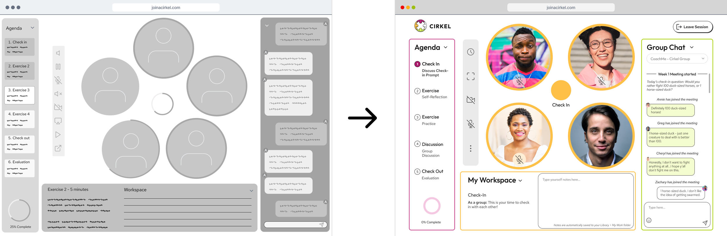
Design | DESIGN SYSTEM & BRANDING ELEMENTS
I developed the visual design elements to represent Cirkel’s joyful and supportive brand
As the visual design lead, I was responsible for creating the branding elements and design system.
I also reviewed and made final edits on my teammates’ high-fidelity prototypes to align with the design system and ensure accessibility before client handoff.
Brand values: connection, joy, vitality, trust, love
Brand attributes: mass appeal, playful, friendly, conventional, young/innovative

Final Interactive Prototype
Client Feedback
Big Takeaways:
Keep a focused scope
We were invited to weigh in on all the new ideas that came up during the project. To avoid scope creep, it became essential for us to help the founders focus on the path forward for a MVP rather than the multitude of possibilities.
Clarify the problem, not the solution you’re trying to build
While the client already had a vision of what they wanted to build, we had to help them understand the problem from the users’ perspectives first before we could design.
Always explain the WHY for design elements
Since our clients had less UX experience, it was essential to explain the reasoning for each design step to to get their buy-in and help them think on behalf of the potential users once we handed off our work.
Next Steps:
1) Conduct usability tests on high-fidelity screens
The natural next step for Cirkel is to conduct usability tests on the hi-fi screens with users (both Participants and Coaches) to identify usability issues and validate that previous issues were resolved.
2) Iterate on high-fidelity designs
Based on usability test results, the content and UI elements would need to be refined so that they are intuitive and relevant for both user groups.
3) Update the Cirkel website
To ensure brand alignment and consistency when presenting to others, Cirkel will need to update their existing website with the content and visual elements my team and I suggested.