
dev launchers
redesigning the online volunteer recruitment flow for an open-source tech nonprofit
Dates: Apr -Oct 2022
Role: UX/UI Designer & Researcher, on a cross-functional team with 1 PM, 2 UX designers, 4 developers
Tools: Figma, Miro
Problem
Dev Launchers is a global nonprofit that helps volunteer tech professionals upskill through open-source software projects. The organization was suffering from a shortage of volunteers and wasting resources using an inefficient third-party recruitment platform. They needed to redesign its online existing recruitment flow to:
Increase # of visitors entering volunteer funnel
Increase # of volunteer applications
Ensure alignment with the org’s design system and backend specs
Solution
As the UX Designer & Researcher, I was responsible for planning and implementing all phases of the design process — from research to handoff — and aligning my team’s work with the organization’s design and tech specs.
I built component-based, responsive designs that:
improved the website’s visual/text hierarchy
provided personalized touch points
aligned with Dev Launcher’s changing design system
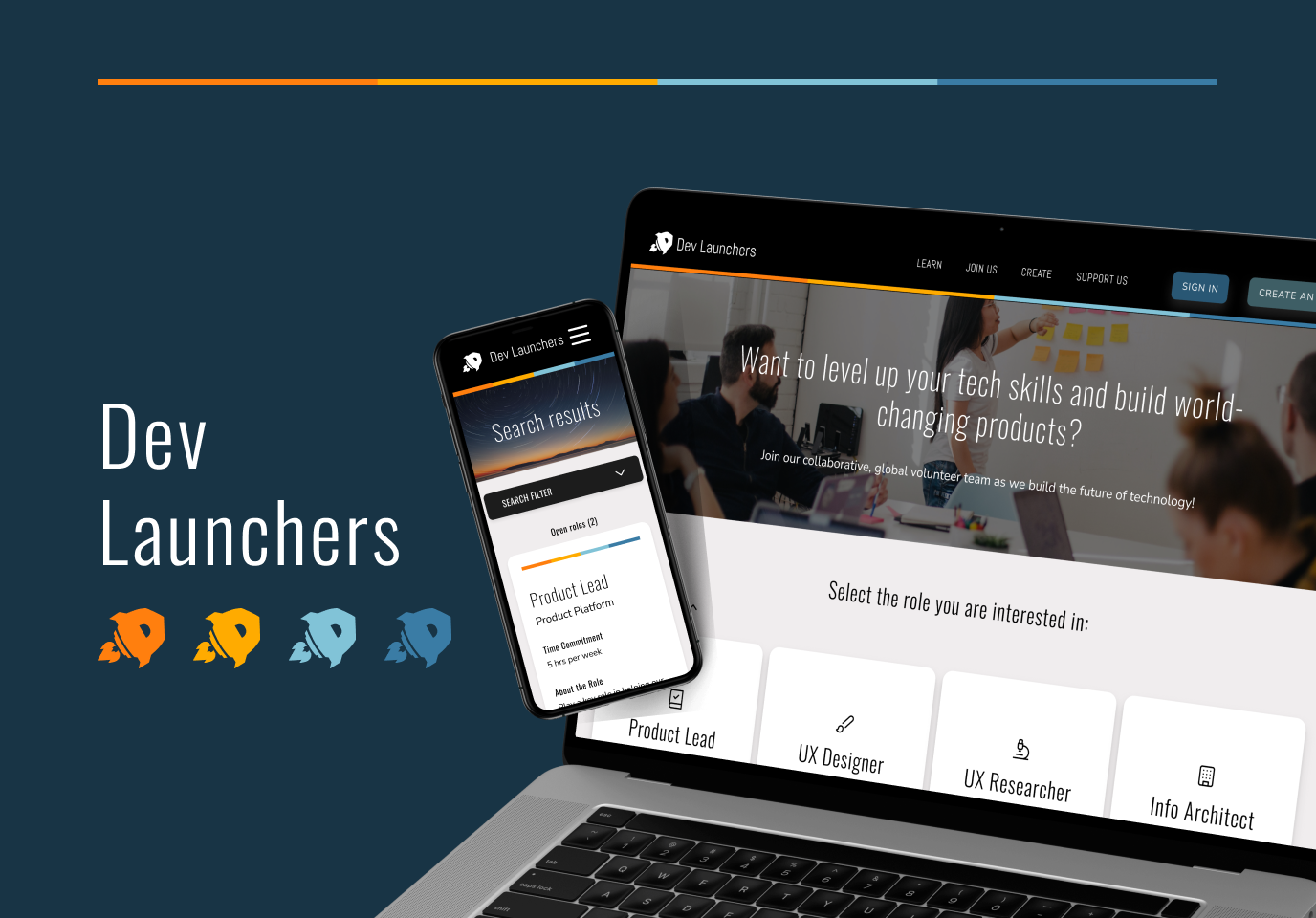
Final Designs

Easily filter by role and your time commitment level. If a role is currently unavailable, you can easily view other (similar) roles.

Easily find and apply to a volunteer role at Dev Launchers through a personalized and streamlined application funnel.

If you don’t find what you’re looking for, you can join the “Talent Community” to be easily notified about new opportunities that match your skills and interests!
Process

Discover | HEURISTIC EVALUATION
A heuristic evaluation identified major usability issues regarding visual inconsistency and hidden cues
We started with reviewing the organization’s personas (tech learners and experts) and identified their primary goal:
“I want to build job-relevant tech skills through practical experience on a cross-functional team.”
With this goal in mind, I reviewed the existing recruitment webpage against N/N’s usability heuristics and found 3 critical usability issues:
Inconsistent visual language (within page and against other website pages)
Hidden CTAs that user would need to understand their next step
Visual/text clutter (“fluff”) that doesn’t help user achieve their goal

Discover | DIGITAL ANALYSIS
Digital analytics of existing pages validated the site’s negative impact on user experience
By reviewing the web page’s performance on Google Analytics and Hotjar, it became clear that there was a huge missed opportunity:
4k+ users were directed to the page from paid search ads in the past 3 months
They spent ~10 secs scanning without clicking (0.2% click rate)
Then they dropped, and never returned…(71% bounce rate, 0 applications)
These findings validated my budding hypothesis:
The on-site experience was confusing. Visitors didn't know what to do, or they didn’t find what they were seeking.

Discover | COMPETITIVE SCAN
Competitors’ websites helped us identify ways to improve clarity and engagement in recruiting
After validating that the website was underperforming, our team conducted a brief competitor scan on other software organizations’ recruitment pages.
Key takeaways:
Tailored search filters are present in all websites.
Most sites have a splash image and header that help illustrate the org culture.
Clear visual hierarchy helps distinguish roles from their descriptions.
All sites provide options to stay in contact for further opportunities.

Define | IDEATION
HMW make the signup experience for volunteers more engaging, streamlined and personalized?
Make the first click more impactful
Filter by role categories before viewing all applicable roles
Modal it up
Use modals for role descriptions and application to simplify the web architecture
Show the culture
Include images and engaging text that explain what Dev Launchers is
Sign in & save (for later)
Allow users to save roles so they can return later or keep updated
Develop | USER FLOW & WIREFRAMES
Our user flow and wireframes included a role “funnel” & email sign-in to personalize the experience

Design | HIGH-FIDELITY USABILITY TESTS
Over 3 rounds of usability tests, we refined the visual language and features
Test 1: Are there any critical errors or confusion points in the user flow?
Main updates:
Simplified search “funnel” to streamline seeing results
Allowed new users to create an account
Test 2: How can we improve visual language and personalization?
Main updates:
Updated landing page with a full image to maximize CTA visual attention
Updated the Sign In modal so it automatically links to Google Sign In (fewer clicks, integrated with system)
Test 3 (A/B Test): Do users prefer to (A) get a heads up about signing in to apply, or (B) not?
Main updates:
Kept the preferred option (A)
Introduced new feature: Users can join “Dev Launchers Talent Community” to be notified about new roles, rather than being forced to create an account


Design | CHALLENGES
Challenge: Redundant work
Limited onboarding/support leading to redundancy in work
Artifacts (personas, research findings) buried in old design/drive folders
How to handle team and design challenges? Be proactive & methodical.
Solution: Map the landscape
Set up calls with senior org members to figure out org processes & best practices
Guided fellow teammates through the design system, research tools, etc.
Challenge: Teammates leaving
Product Lead left in 1 month & all 4 developers left in 3 months, resulting in unclear handoffs
New junior UX designer introduced halfway in (with limited UXR experience)
Solution: Consolidate knowledge
Helped get new members up to speed by creating clear versioning and file organization
Coached new designer and had her “shadow” research interviews to gain her footing
Challenge: Design system changes
Major changes made to the org’s design system every month, disrupting designs
My team was the first to retrofit our designs into new Tailwind CSS breakpoints and grid system
Solution: Build within the system
Guided fellow designers in transitioning to new design system and designing for responsive breakpoints
Simplified design updates with components, Auto Layout, and connecting all designs to the design system
Challenge: Slow development
Delays in development due to team members leaving
Developers working with outdated Storybook components, resulting in manual coding.
Solution: Learn to think like a dev
Worked closely with new developers to explain design decisions for specific screens/flows
Learned CSS/HTML to understand how to design with front-end in mind
Final Interactive Prototype
Next Steps (Ongoing)
Build
The designs are currently being developed. After they are finished, we would QA them and then publish them to the Dev Launchers website
Test
Over the next 2 weeks, track metrics (i.e., click rate, bounce rate, rate of user application completion, rate of account creation, average time spent on page, etc.)
Learn (& Build)
Use data to identify drop off points and barriers to completing the application process. Use learnings to make adjustments to features as relevant and learn from the data again.